Aqua Centre, Tzaneen
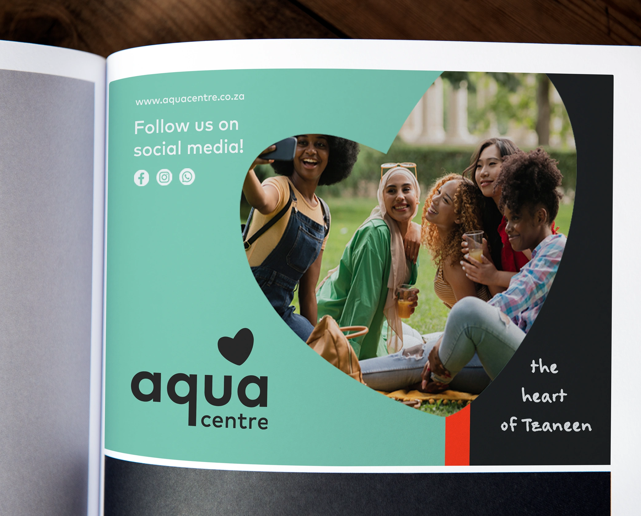
The heartof Tzaneen
From a tired building to the Heart of Tzaneen. Aqua Centre is now a space shaped by the beauty of its surroundings, with materials that reflect the landscape and breeze blocks that keep things cool in the summer heat.
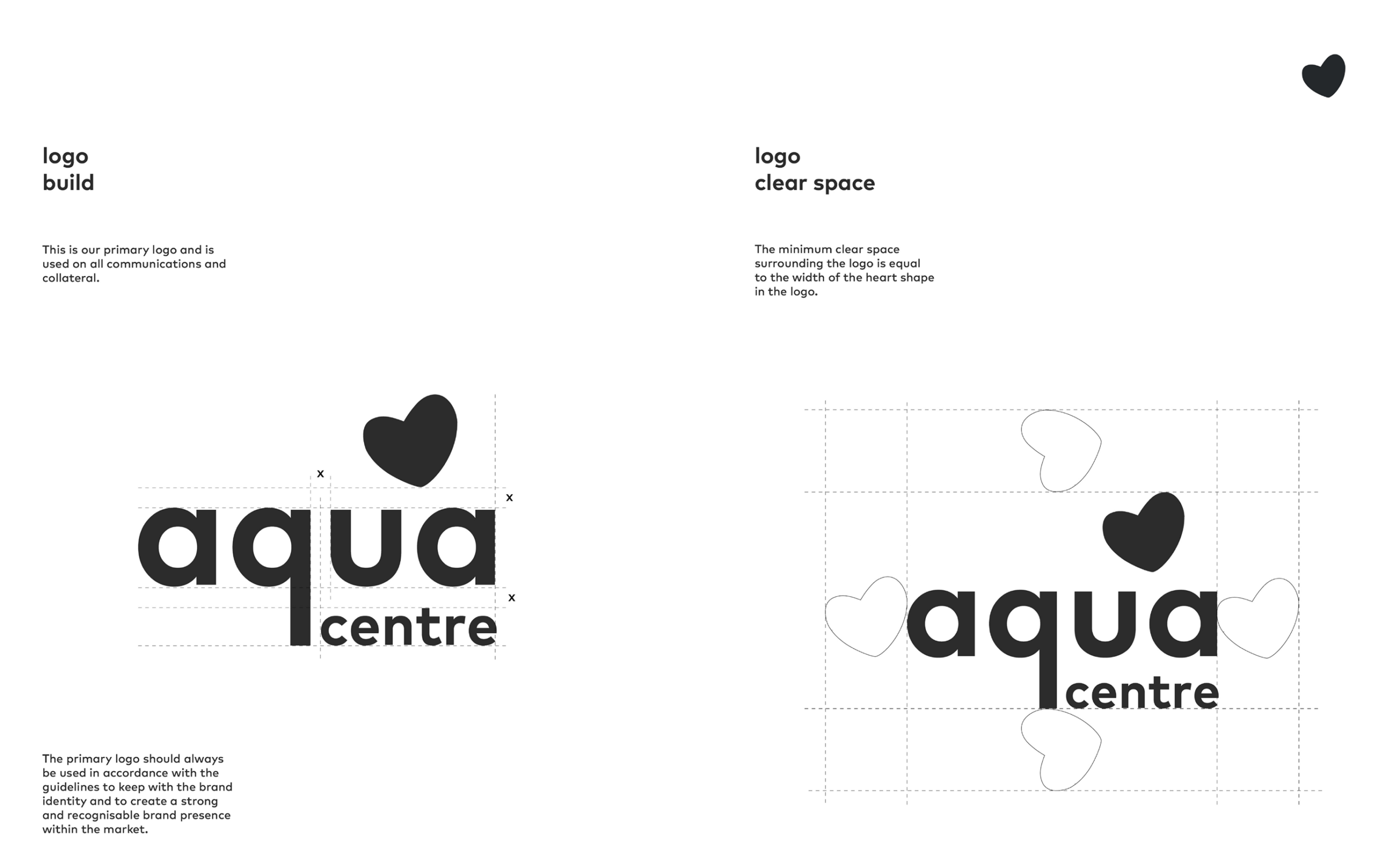

Organic cues are woven in subtly, from the heart-shaped brandmark to elements inspired by local produce and farm animals. A nod to the client’s avocado farm finds its way into the stacked logo – a playful detail that keeps the identity approachable and grounded without feeling overly literal.

A systemthat connects
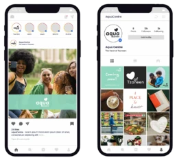
A flexible system spanning signage, print and digital, combining structured type with a handwritten layer. Grid-based icons bring clarity, cohesion and ease.
Icon application
Drag to explore images